DAYUL SOOP CAFE (2026)
Branding Design
Tools: Adobe Illustrator, Adobe InDesign, Procreate, Figma
Branding design of a cafe in the forest, where they wanted people of all age have fun in their own way with nature. Brand image was created through the forest and trees surrounded near cafe.
Cafe Overview
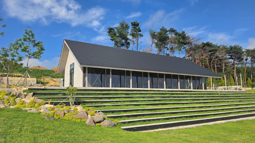

Dayul Soop cafe is in the forest, where the client wanted people to have a break and healing time outside the city where people all ages can have fun. They wanted to their unique features of mountain view cafe with large area to walk around with nature to stand out. This is where I incorporated the trees, forest and wood as the main design factor to really emphasize the aesthetic of this cafe’s unique features.
 477, Dongnam-ro, Buk-gu, Ulsan, Republic of Korea
Logos
I created two logos as client’s request, where one shows cafe’s identity and another one showing the building of a main cafe. They wanted it to be fun but minimal at the same time which aligns with the aesthetic of the actual main building.
Logo 1: Brand Identity
Emphasizing the most unique part of this cafe, which is nature, tree, and forest. I decided to use the shape of the tree as the main identity for the minimal and simple logo. To achieve the minimal aesthetic, I used the line art style to illustrate tree. I put the circle around the trees to show that this is the space where you can be around nature and do a lot of activities with nature.
Logo 2: Main Cafe Building
This logo portrays the main building of the cafe. The main building of the cafe is made entirely out of wood, which client was really proud of and wanted to emphasize it. So I traced the building using Adobe Illustrator to make it look like a building and created the path, lawn, and trees. These elements represents the cafe itself well, since customers can take the path to walk around the forest.
Font
다율숲
Font: Gowun Dodum
Simple, Minimal, Friendly, Warm, Calm, Natural
With the Korean font, client wanted it to be very welcome vibe with a simple and minimal aesthetic like the main building and overall cafe’s mood. The font isn’t too stiff and also gives natural aesthetic which reflects the nature around the cafe.
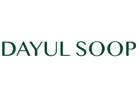
Font: Quiche Text
Creative, Timeless, Minimal, Curated, Luxurious
Client wanted English font to be more curated and simple compare to the first one. So we decided to do a Quiche font which also portrays premium experience cafe.
Cup Design
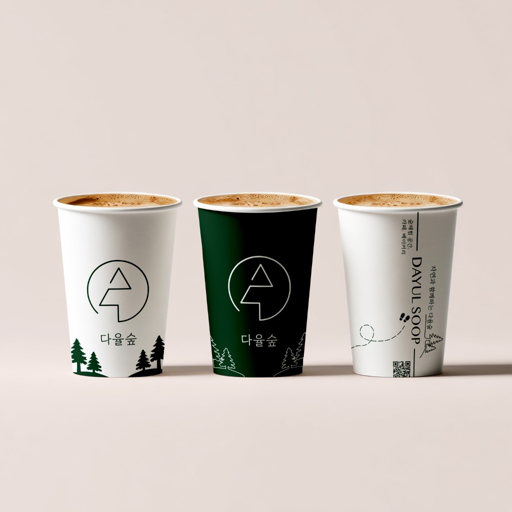
With the cup design, I placed main logo at the center to indicate a cafe. I also used the same color scheme as the logo I used for the consistent cafe branding. I added forest illustration under to make cup more fun and shows cafe’s identity.
Back design of the cup, which is the third cup on the image, has the cafe name in English and also a qr code to the cafe website as a client’s request. In Korean, I also wrote cafe, bakery, and cultural space to inform the users about the place they are currently at. I added some foot silhouette to make it more fun and connected with the front side of the cup.
Merch
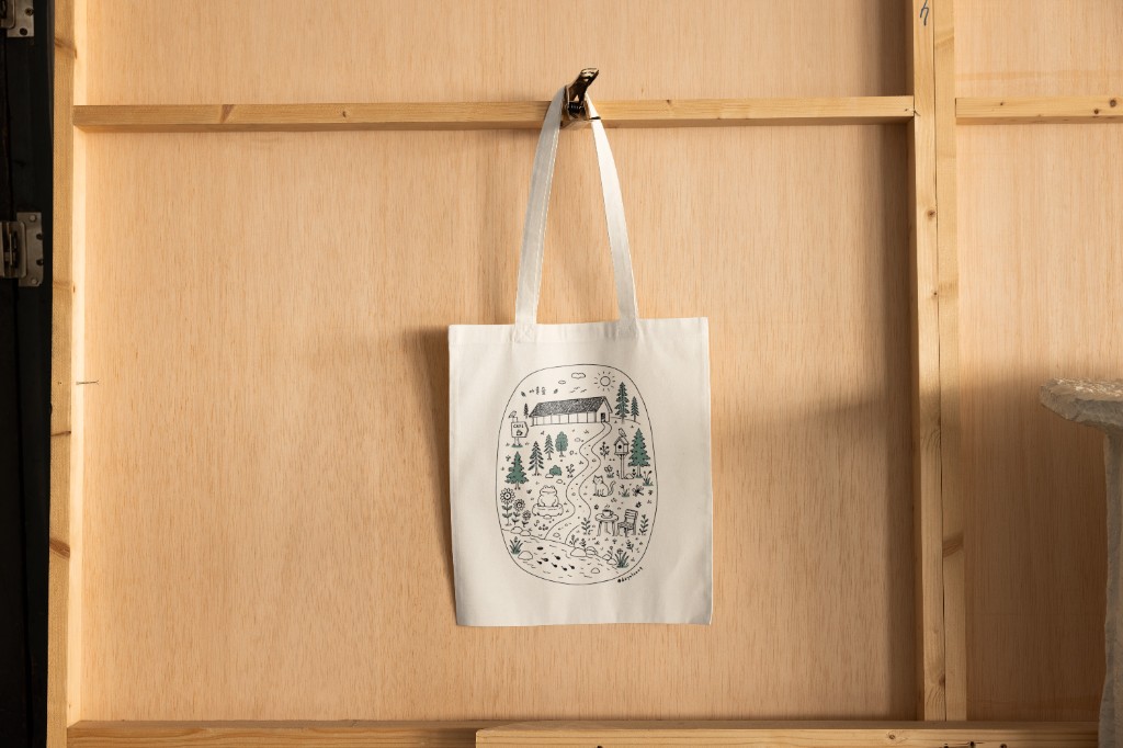
For Dayul Soop Cafe merch, the client wanted something that users can use in daily lives, which can also use as an advertisement. With various merch ideas, we decided to create tote bag as a first merch considering the budget and in order to advertise we realized tote bag is the best options.
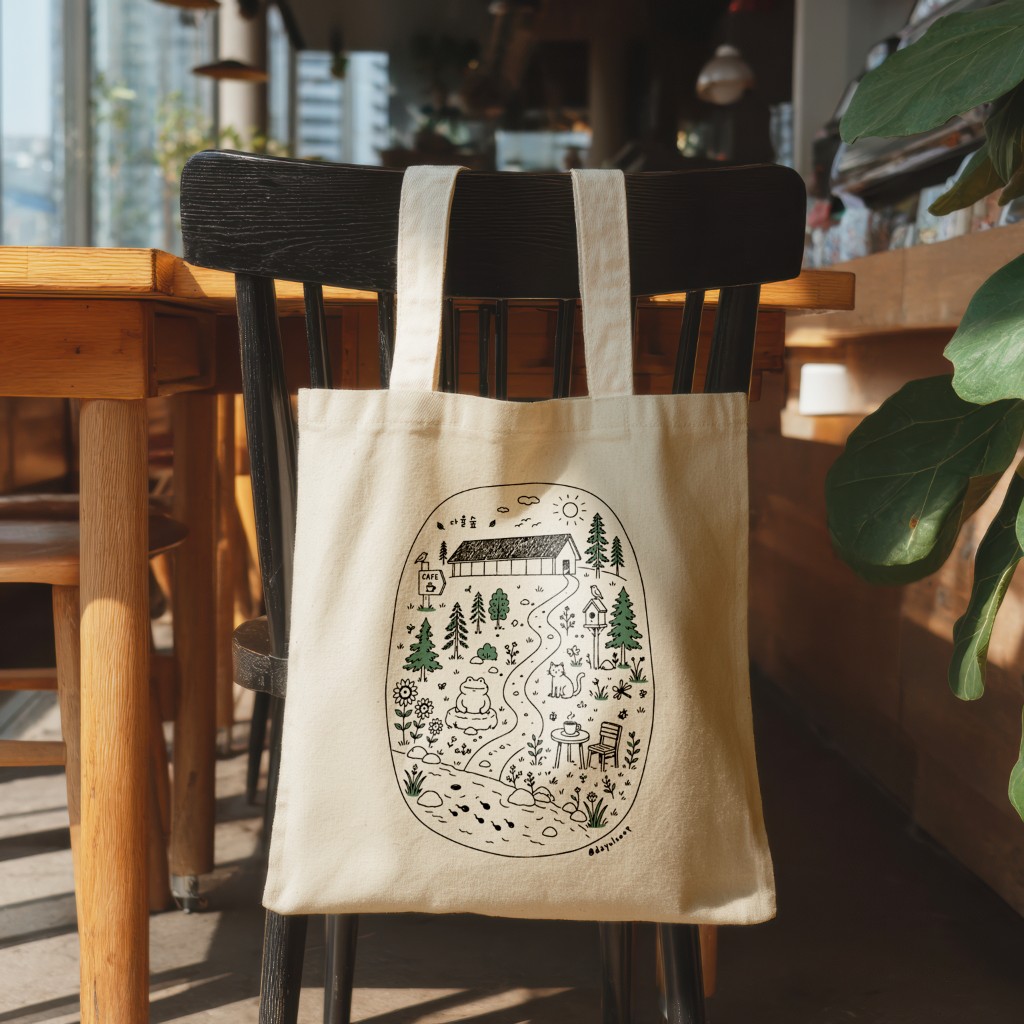
For the design of the merch, I tried my best to emphasize the unique fun features in the cafe and also keep the natural aesthetic and also fun design for all age can use. I decided doodle style is the best way to achieve it. Some of the doodles that I draw to show Dayul Soop Cafe are:
- Bird house that is displayed around the forest
- Pond with tadpoles
- Yellow flowers
- Trees
- Toad shaped rock
- Cafe building
- Places where customers can drink
Other Designs
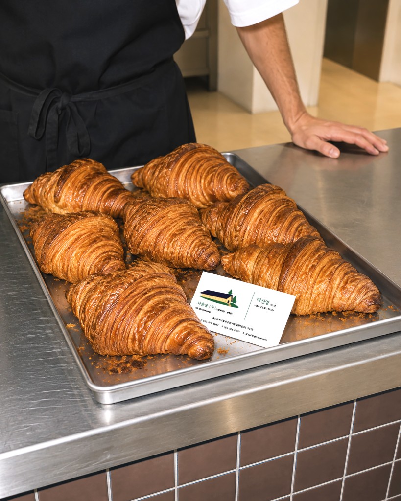
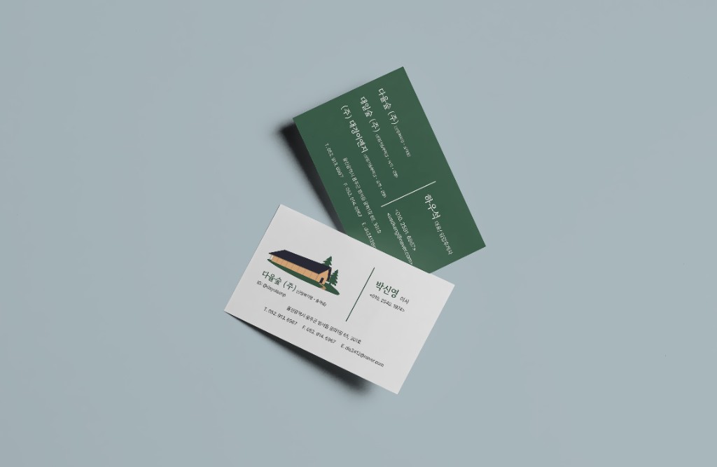
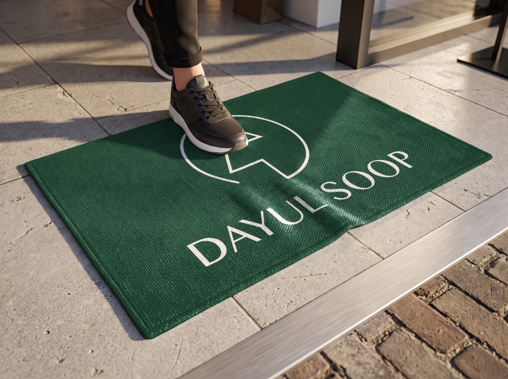
Floor Matt

Additional Planning
Client wanted customers not only use this Dayul Soop Cafe as a place to drink but also a place to have fun. They wanted this cafe to be more than a cafe and be a cultural space. So we decided to incorporate some activities for customers to do while spending time at this place and feel welcomed.
Activities
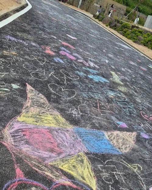

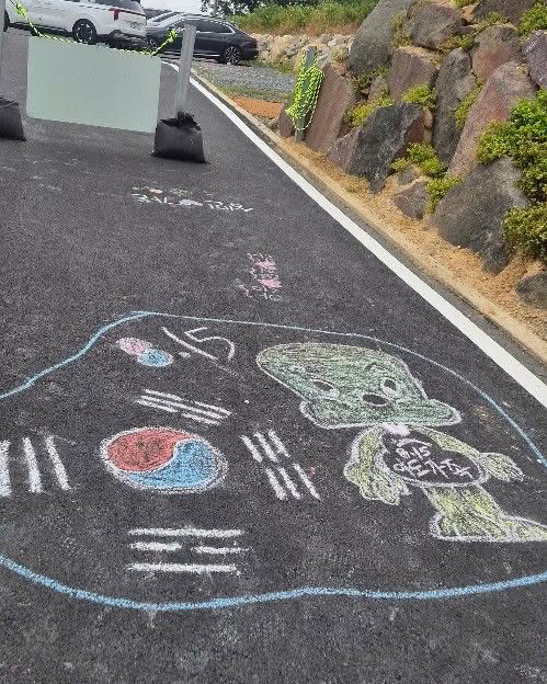

Brought an idea of using chalk for people to express their creativity and enjoy the time while in the cafe. This activity is loved by all age range customers since they are able to write or draw whatever they want on the road. These activities are rarely found in South Korea which is a really strong unique feature of this cafe.
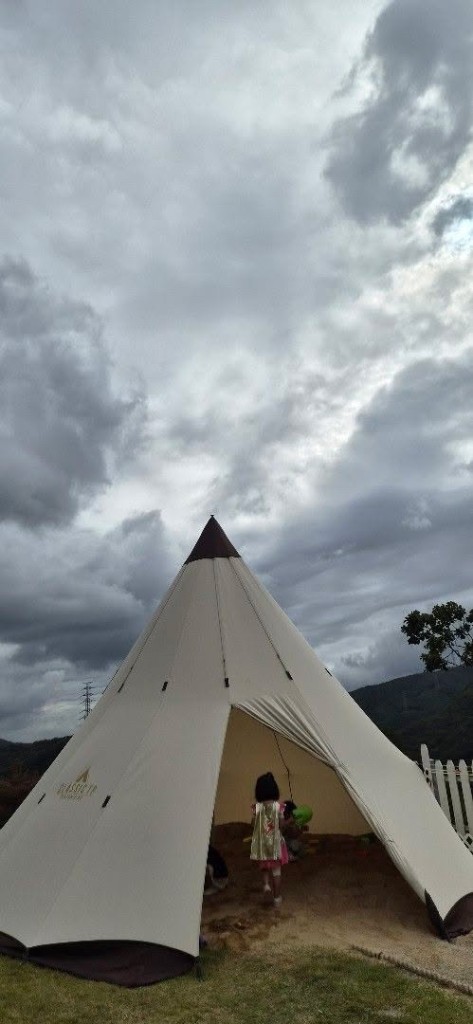
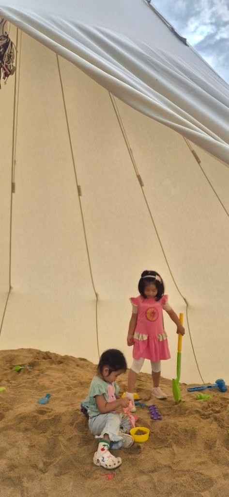
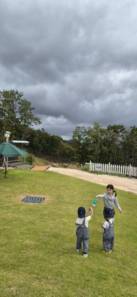
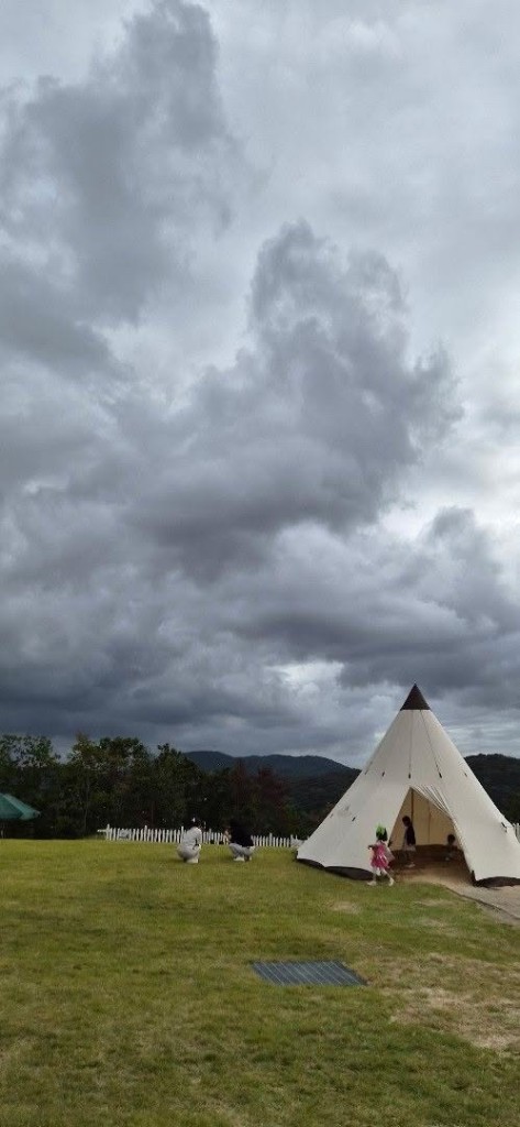
Adding a huge tent in the lawn so younger age customers are able to have fun in nature and also put the sand area where they express their creativity. This is also a very unique feature for this cafe, since it is really hard to find area like this in the city.
Halloween Event
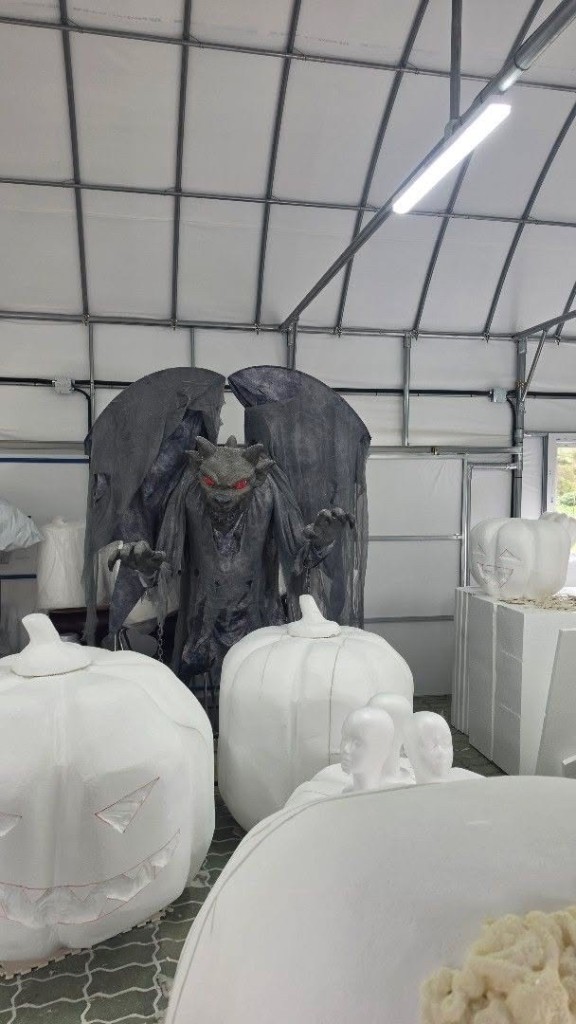
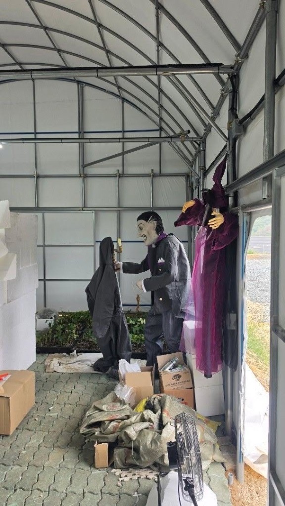
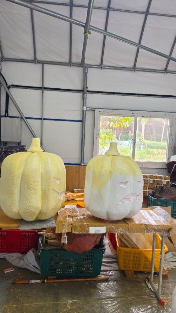
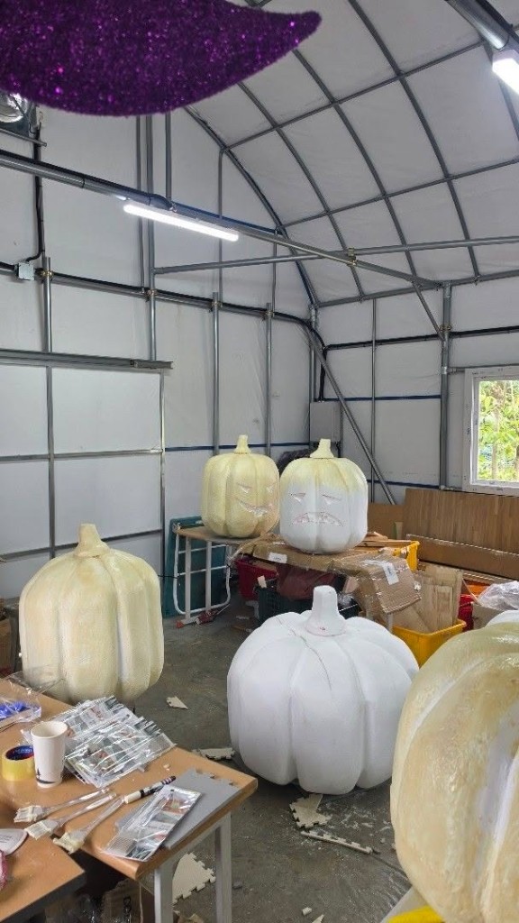
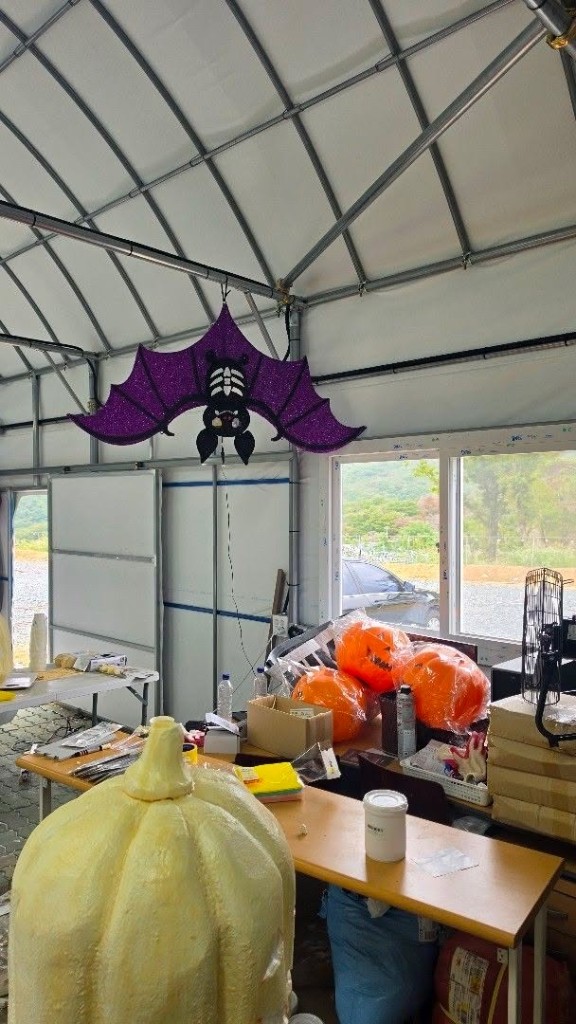
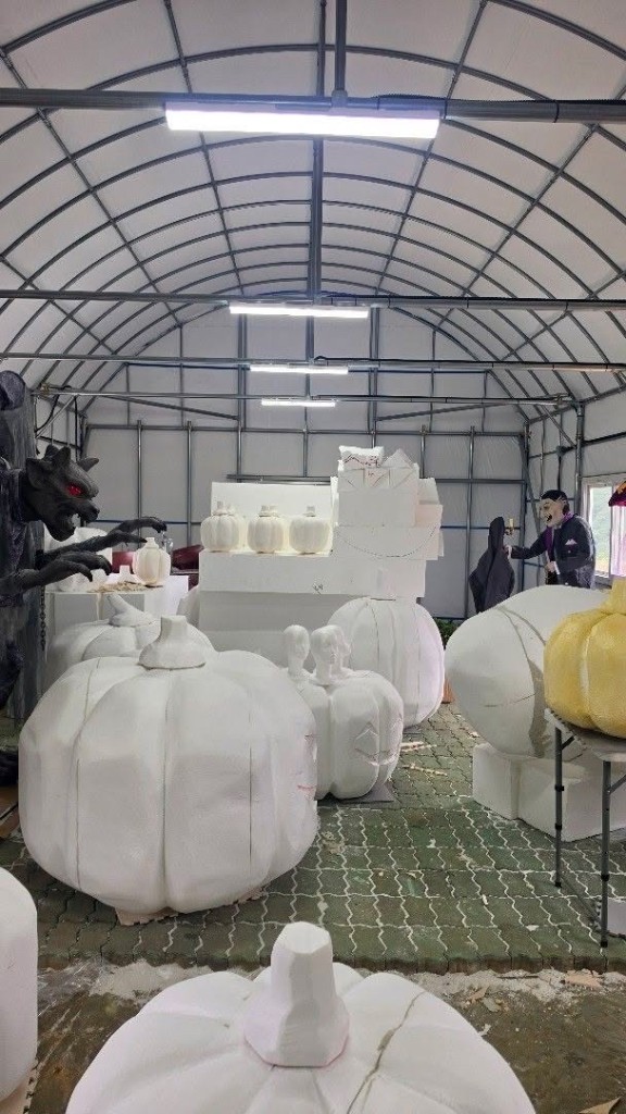
Communicating with the client through virtually, we are currently planning on a halloween event for the october. The images shows halloween decorations that will be used in the cafe.