NAVIGATING LUAG (2025)



UX Design | Inclusive Design
Tools: Adobe Illustrator, Figma, Laser Cutter
Team: Dayna Ha, Jua Kim, Ashley Yoon, Dustin Braufman, Hayden Highley
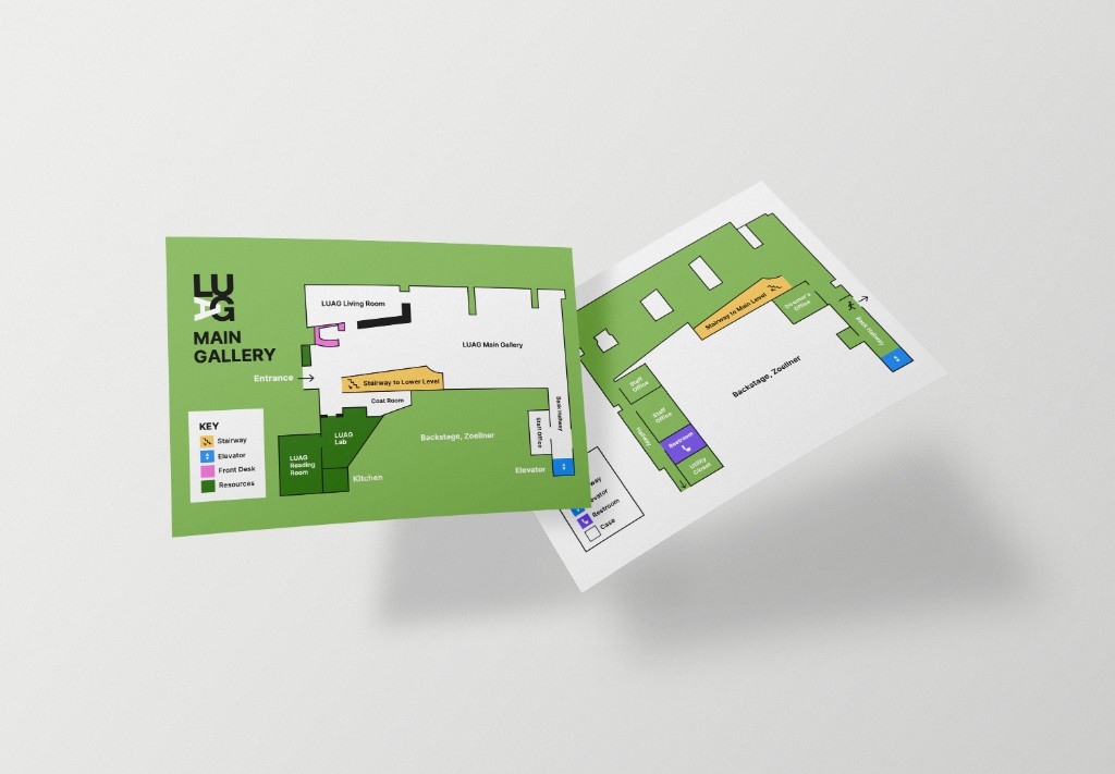
UX Case Study: Our group aimed to create an accessible and inclusive 2D and 3D map for Lehigh University Art Gallery (LUAG) and also signage to indicate the location of the facilities inside LUAG for visually impaired visitors.
Overview
Many visitors to the Lehigh University Art Gallery struggled to navigate its interior, limiting access and engagement with the space. Our team designed a comprehensive wayfinding system to address this, delivering three components:
- Bilingual directional signage in English and Spanish
- A 2D print map with a separate Braille tactile overlay
- A 3D printed tactile floor model of the gallery
Tools used included Figma, Adobe Illustrator, and Blender. The project reinforced that effective wayfinding shapes how people feel within a space and determines who feels welcome in it.
The Problem
- Many visitors struggled to locate LUAG or navigate its interior spaces
- Limited access and overall engagement with the galleries
- Existing signage and maps were minimal and not designed with accessibility in mind
The brief challenged us to address three key goals: clarity, accessibility, and aesthetics. We wanted to create a welcoming experience for all individuals from the moment they arrived.
User Research
We conducted interviews and mapped journeys for visitors who experience the gallery differently. Two primary user types shaped our design decisions:
- Visitors with low vision — need high-contrast wayfinding, clear hierarchy, and predictable paths through the space.
- Visitors who rely on Braille — need tactile information that can be read by touch, including overlays and a 3D floor model.

Progress: Directional Signage
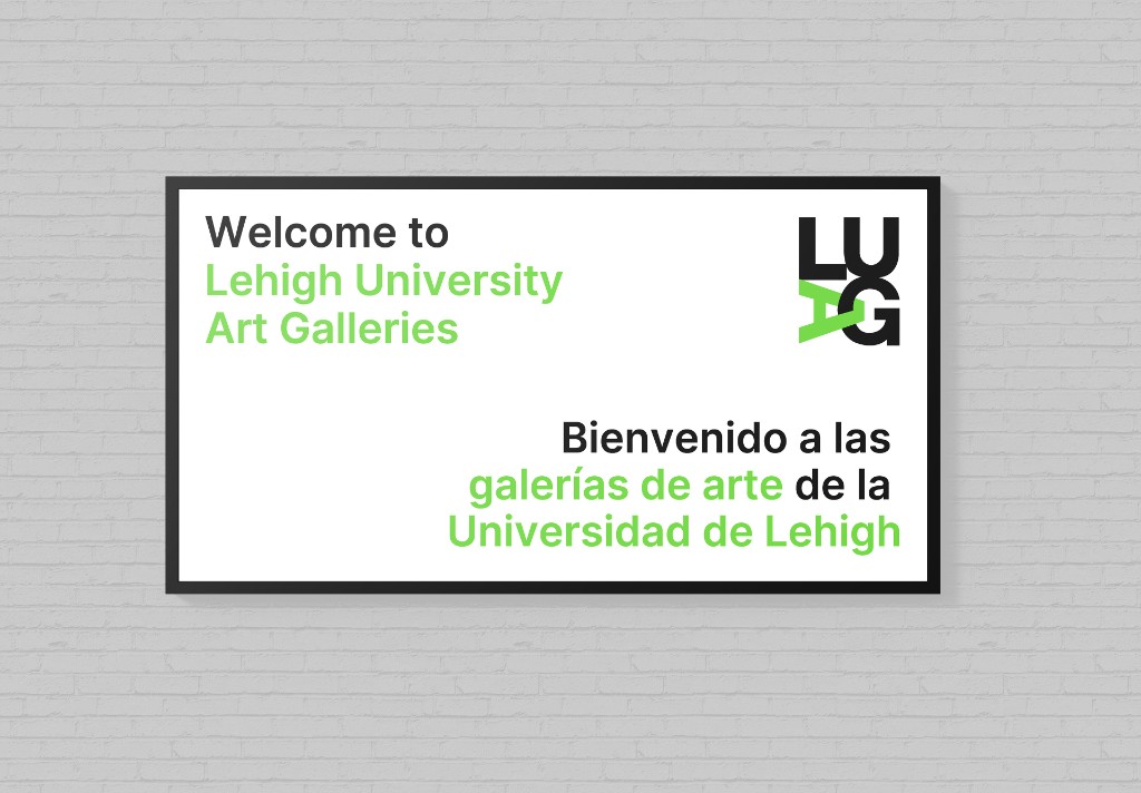
As a group, we conceptualized signage that would be simple and accessible to all visitors while blending seamlessly into the gallery environment. We chose to use the same color palette and typography already established by LUAG, so the signage would feel like a natural extension of the space rather than a distraction. The signs are bilingual in English and Spanish, with deliberate spacing between the two languages to avoid visual confusion. We focused on the three facilities that visitors most frequently struggled to locate: the water fountain, elevator, and restroom. Placement was a key consideration as well, with spots selected throughout the gallery to maximize visibility and ensure visitors could orient themselves with ease. The signage was designed and produced by Dustin.
View full signage files →
Progress: 2D Map
Map Illustration
Sketch:
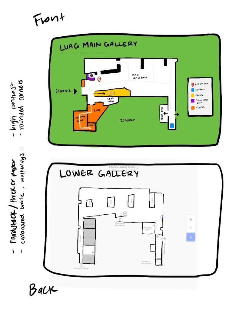
The ideation process began with Jua and Ashley sketching the initial layout of both the LUAG Main Gallery and Lower Gallery. The sketch established the overall structure of the map, including room labels, walkways, entrances, and a color-code rooms. My contribution at this stage was providing feedback on the color scheme and overall visual organization, which informed decisions like using high contrast colors to distinguish spaces, rounded corners for a more approachable feel, and cardstock for durability.
First Draft:
From the first draft, we decided make design more visible and aesthetically pleasing. We first added a background color of LUAG's original color and made a box that indicate what each color in the map represents. This helped overall map more organized and visually more appealing.


Final Illustration:
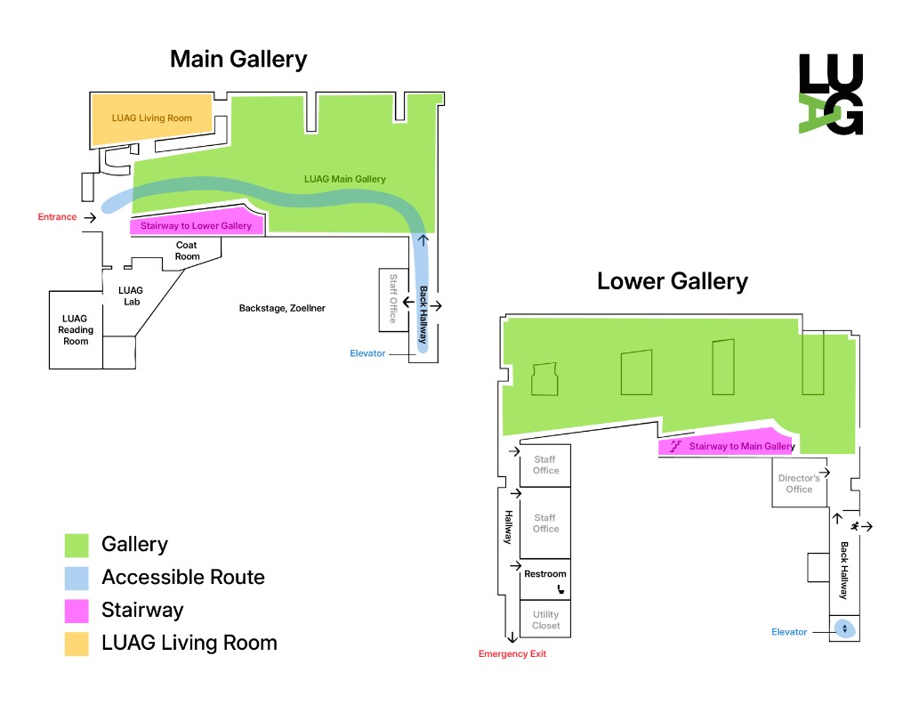
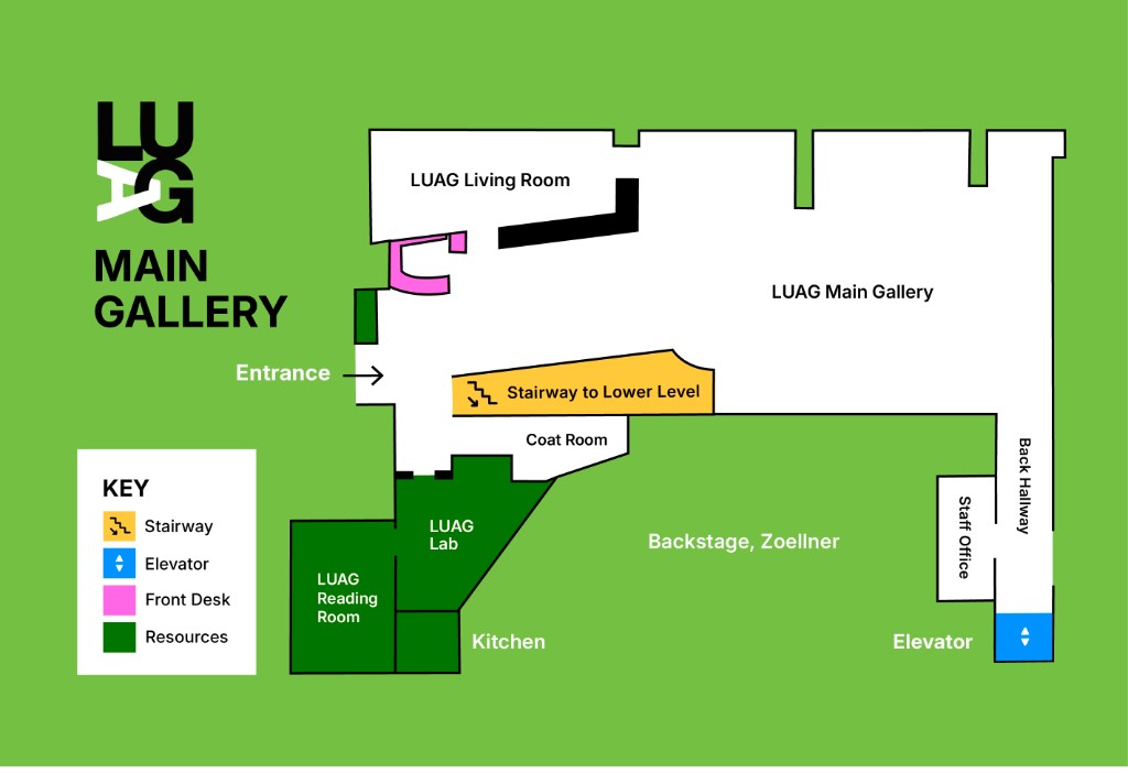
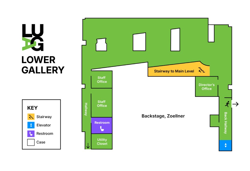
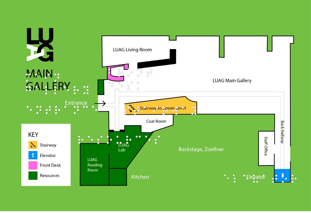
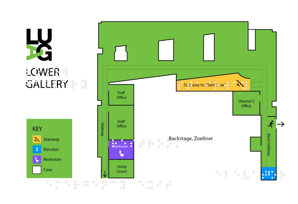
After few adjustement with professor's feeback, we finalized the illustration for the map illustration. We switched the background color of main gallery which is the front page of the map and the other side, lower gallery to white so users can identify the front and back of the map easily. We also added additional key color-coded rooms to show restroom, resource rooms, and case which shows the fixed place for the exhibition. We also made some small changes in terms of font size and the thickness to make the map more aesthetically pleasing.
Braille and Path
Braille First Draft:
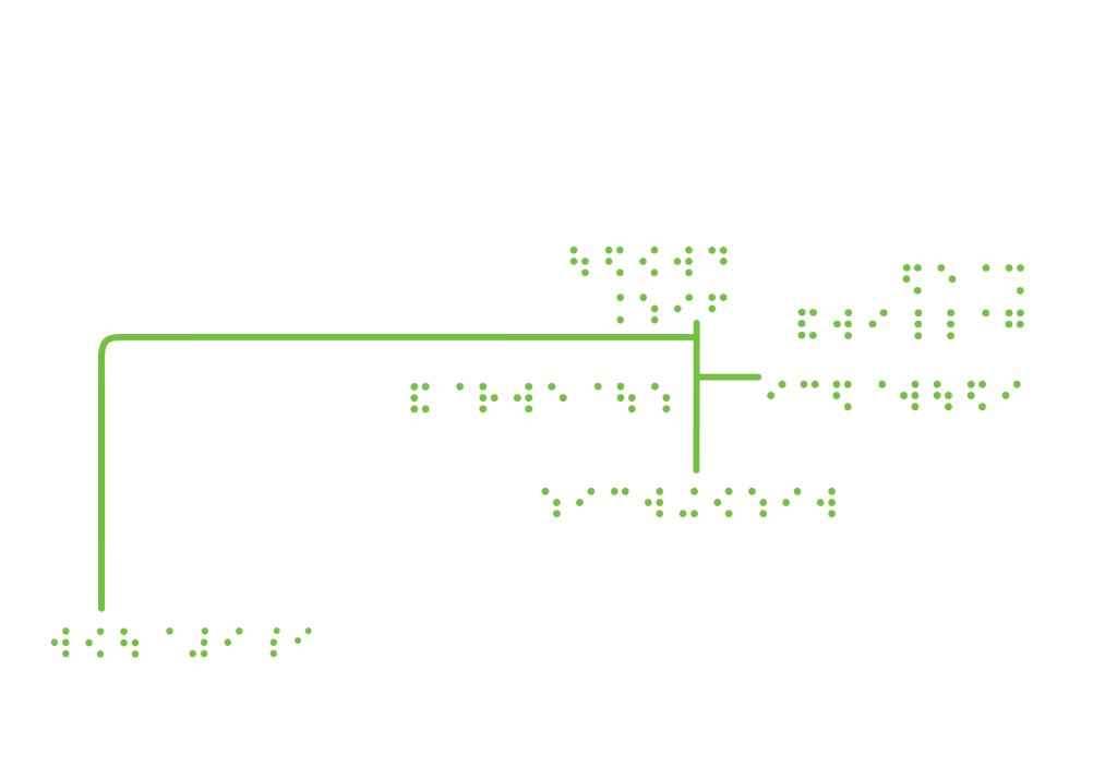
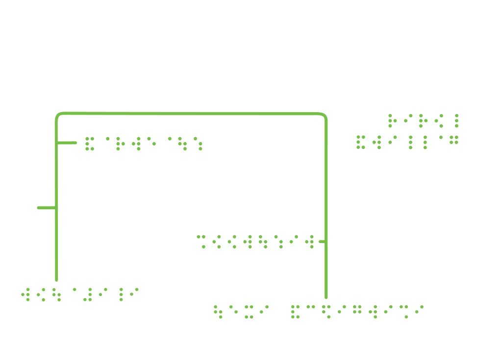
To ensure the map was fully accessible, I took on the task of integrating Braille into the design using Adobe Illustrator. This involved researching accurate Braille translations for all labeled spaces and overlaying them onto the digital map alongside a tactile pathway to guide low vision visitors through the gallery. Adding this layer required careful attention to placement and scale to ensure the Braille would read correctly once physically produced.
Final Braille Design:
After finaliing the braille, I put the Braille illustration file on top of the final illustration to see it allignment to later we could laser cut the frame of the braille path to print out the braille on the cardstock.
Physical Braille Work:
click to see the other progress photo
Jua and I handled the physical production of the Braille layer. We used a laser cutter to engrave the Braille dots and tactile pathway into 3mm clear acrylic, which would then serve as a mold run through a rolling press. The process required multiple attempts to calibrate the laser cutter settings precisely enough to produce dots at the correct depth for the embossing to register properly.
After the braille framework was made, we printed out the same map with three different types of paper (various thicknesses and materials) and had to soak them in water before rolling them through the press. Confirming that the ink didn’t bleed, we noticed that 2 types of paper were too thin to be rolled through after sitting in the water, and with the paper that was the most sturdy and in shape, we used the press and rolled through the map and the frame together, and dried it for 2 days.
click to see the other progress photo
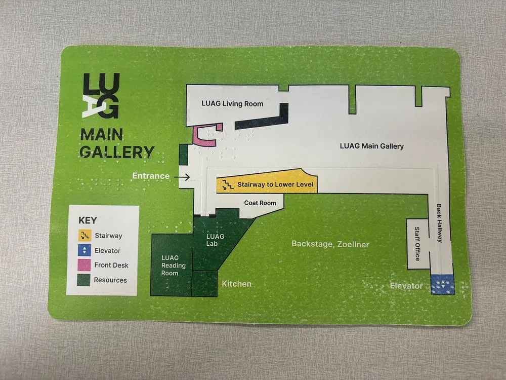
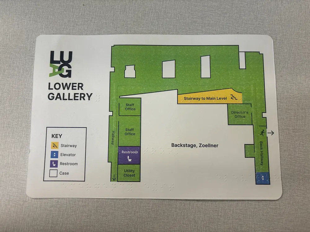
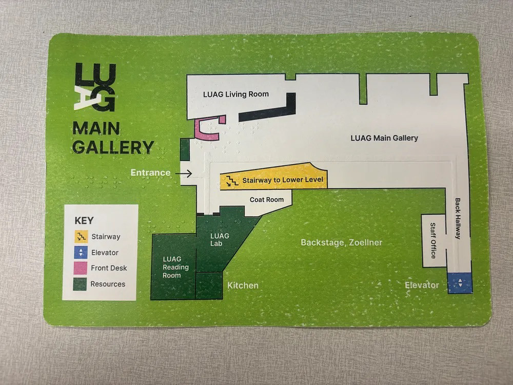
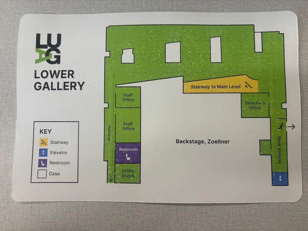
Despite our efforts, the embossing produced Braille that was too shallow to be reliably felt, with some dots barely noticeable. We mounted the map anyway by gluing the front and back sides together to evaluate the final appearance, but the result was unsatisfactory. The layering further obscured the Braille, making it even less legible by touch. This prompted us to rethink our approach entirely.
Visual Map:
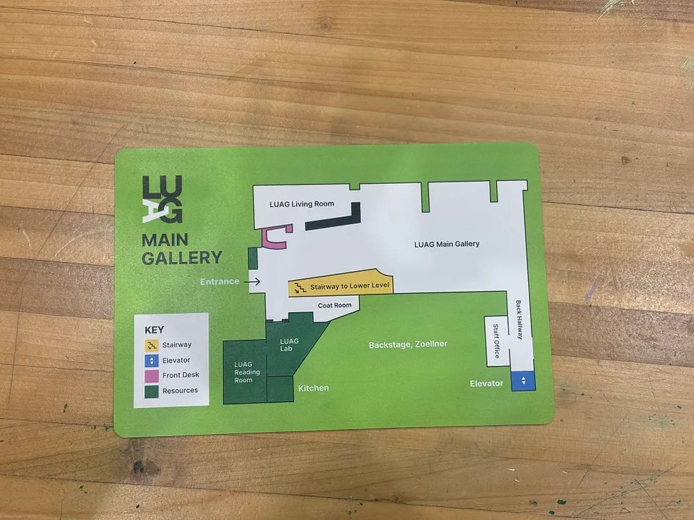
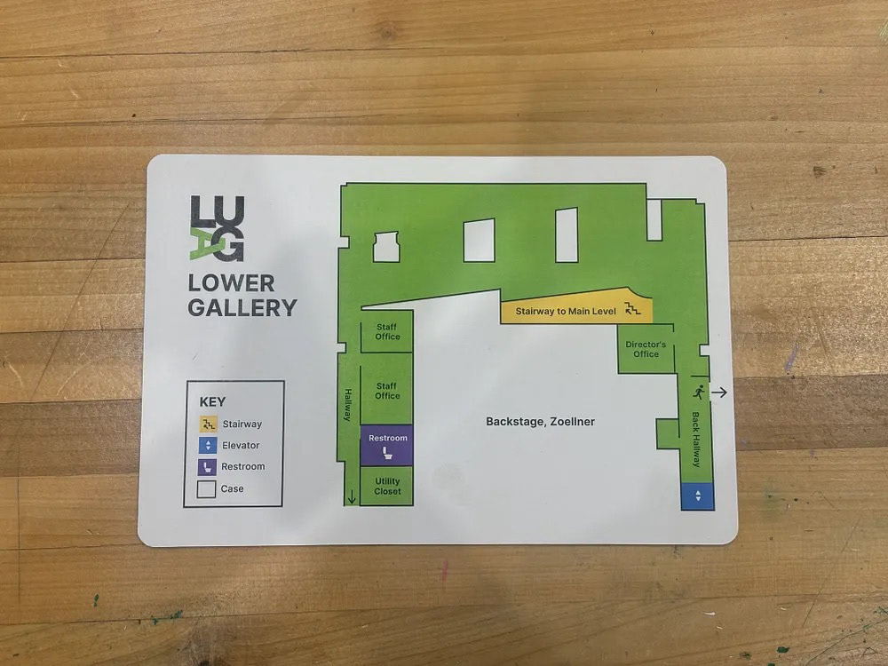
Physical Braille Map:
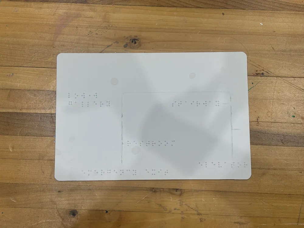
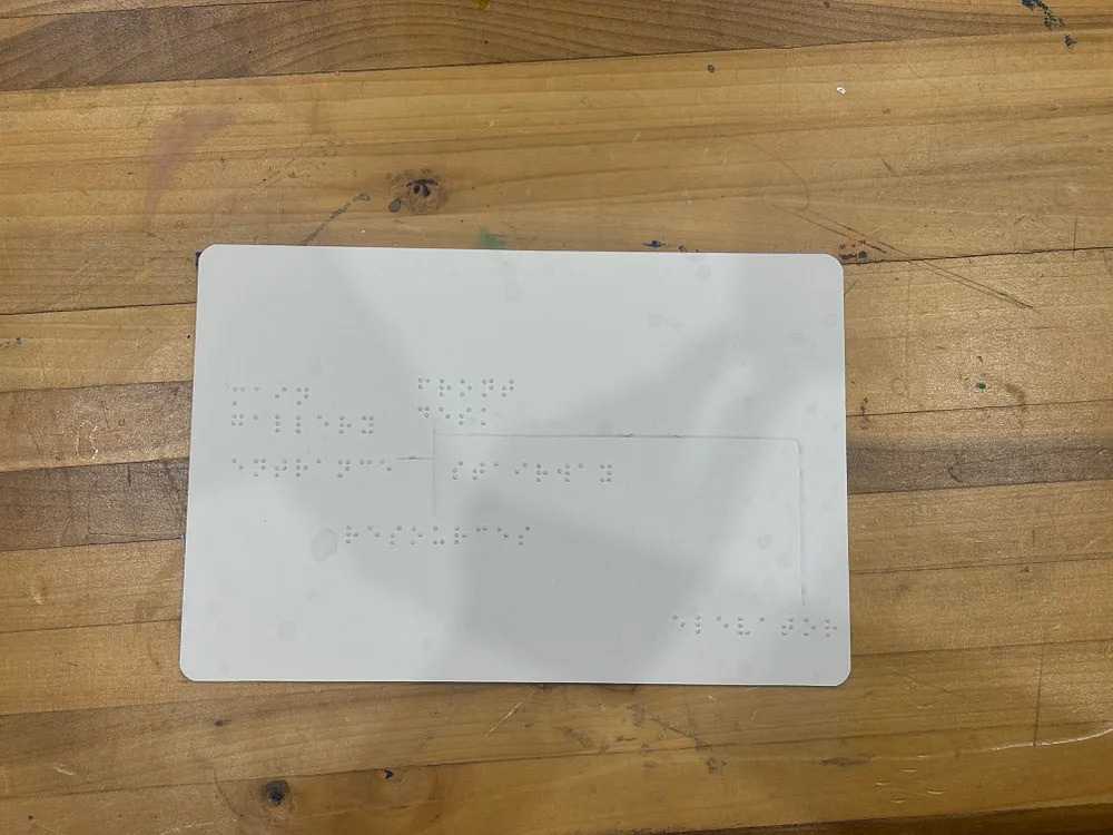
We pivoted to separating the visual map and the Braille into two distinct elements. This solved several problems at once: it freed us from the constraints of finding a single paper that could serve both purposes, made the Braille more accurate and functional as a standalone tactile piece, and produced a cleaner visual result overall. The two-part format also made the system easier for gallery staff to replicate and maintain going forward.
Progress: 3D Map
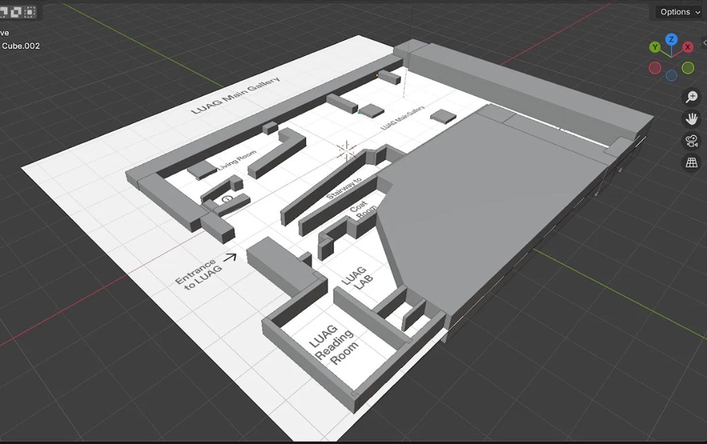
Drawing from a previous project involving 3D-printable map models, Hayden manually built a 3D model of LUAG in Blender using the gallery’s floor plan as a reference. Starting with rough block forms, he refined the model by evenly scaling the wall shapes and adding an ergonomic platform base.
Custom symbols were then added to represent entrances and stairs. For the basement level, Hayden carefully aligned the floor plan references using Blender’s opacity settings to ensure the two floors would stack accurately, and added a 3D restroom model to match the floor plan documentation.
Final Deliverable
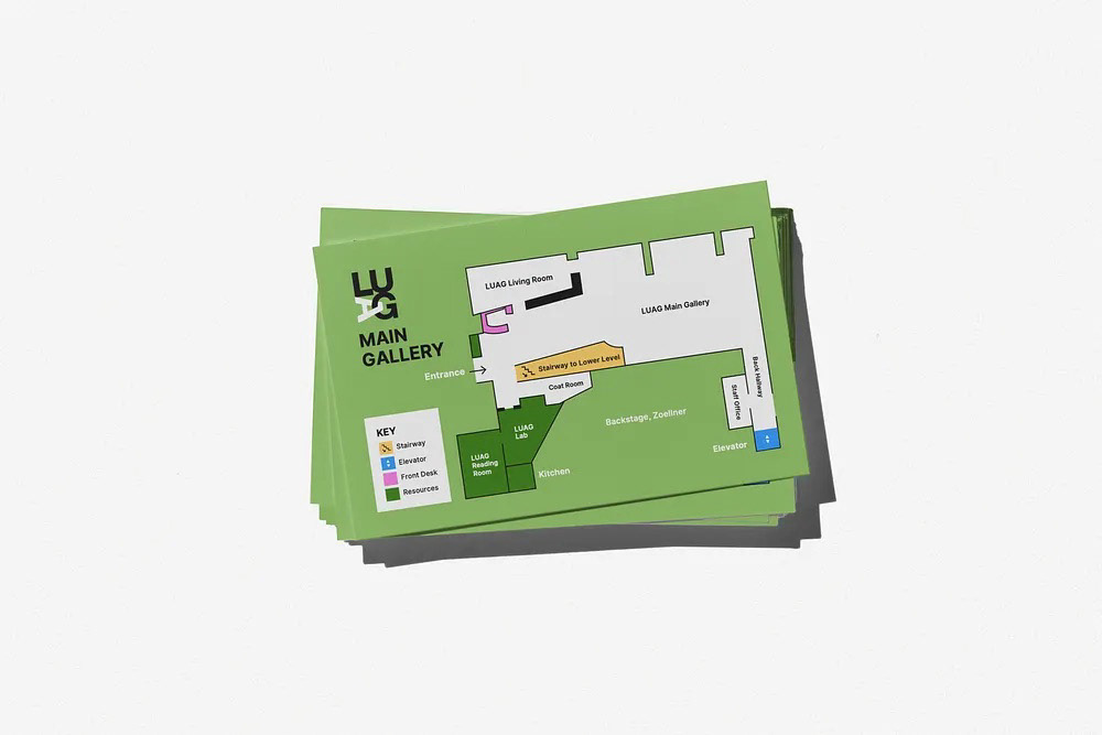
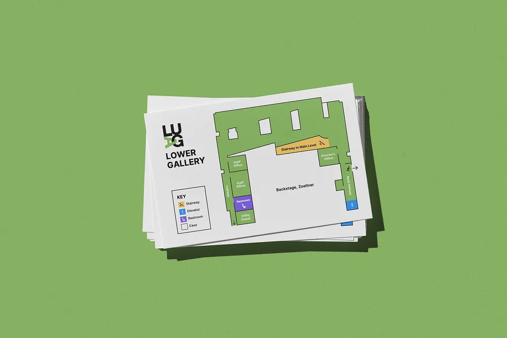
- A print map designed for both clarity and style, distributed near entrances
- Directional signage using consistent and clear typography, also engaging Spanish-speaking users
- A three-dimensional tactile floor model featuring raised textures and Braille labels to support low-vision visitors
Key takeaways
We are proud of how the final designs address accessibility and usability through deliberate, considered choices. Given more time and resources, we would have conducted user testing with low vision participants to further validate our work and found a more effective method for integrating Braille directly onto the visual map.
Ultimately, this project demonstrated how design can bridge inclusion and experience. Wayfinding is not just about directing people from one point to another; it shapes how visitors feel within a space and who feels welcome in it. We hope LUAG considers implementing a system like this to make every visitor's journey more intuitive and memorable from the very start.